Using graphs and diagrams to explain
January 23, 2008 at 1:36 pm 3 comments
I recently had a discussion with a colleague about how we should represent the findings of an evaluation study. I am a big fan of using graphs and diagrams to explain the findings – as they say a “picture tells a thousand words”.
But we often see many misuses of graphs and diagrams that can provide an incorrect idea for the reader. I came across an example from a report recently which I have reproduced here:
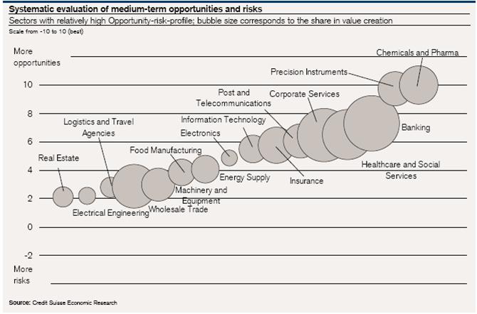
This is an interesting example of a pictogram or scatter chart to represent two variables: 1) level of opportunity/risk (vertical scale) and 2) size of share value (size of bubbles).
But examing this chart, it made me wonder – what does the horizontal scale represent? In other words, on what basis are the bubbles placed left to right? I cannot see any logical basis in the chart for the horizontal location of the bubbles. I think that’s unfortunate as such a chart could use the horizontal scale to reinforce the share value variable or distribute the bubbles on another basis (e.g. sector of interest).
For those interested in graphic presentation of information, some key texts to read are found on the website of Edward Tufte, a leading specialist in this area.
Glenn
Entry filed under: Evaluation reporting, Evaluation tools (surveys, interviews..).
3 Comments Add your own
Leave a reply to Juan Paulo Ramirez Cancel reply
Trackback this post | Subscribe to the comments via RSS Feed

1. Juan Paulo Ramirez | February 22, 2008 at 6:20 pm
Glenn,
You are absolutely right! There is a lot of misuse of graphs, and as you pointed out the lack of appropriate design on those. But besides, tables are overused and misused as well. When I see a table, I see right away a graph.
Good job!
Juan Paulo.
2. Bill Bartmann | September 3, 2009 at 10:38 pm
Excellent site, keep up the good work
3. deepansh | June 14, 2010 at 8:48 am
yes,in the country misuses of graphs and statistics is a major problem