Posts filed under ‘Evaluation reporting’
Writing for evaluation reports
Here is an interesting post from the Better Evaluation blog on writing evaluation reports, with their key points summarised as follows:
- Get to the point
- Develop the best structure for your report
- Report strong findings
- Write for your users
- Be aware of how the evaluation’s scope can affect its useability
- Allocate time for writing, editing, and quality assurance processes
In summary, the post highlights as key: “Evaluators need to communicate better and foster the utilisation of evaluation findings through clear and engaging writing“.

Integrating communications in evaluation – presentation slides
Earlier this year I gave a presentation on “integrating communications in evaluation” and I am now happy to share the presentation slides of the event:
New resource: Evaluation of Humanitarian Action Guide
ALNAP has recently released their Evaluation of Humanitarian Action Guide.
The guide was six years in the making and contains detailed advice and tips on evaluating humanitarian action. Even if your focus is not on evaluating humanitarian activities, Chapter 17 on Communicating and Reporting Findings and Results is well worth a read.
New online course: Effective and Creative Evaluation Report Writing
I’m happy to announce my new online course on effective and creative evaluation report writing. In this course, you can learn best practices for effective and creative report writing specific to evaluation reports. Learning points and practical exercises are combined to develop skills in putting together an effective and engaging evaluation report.
The course comprises of reading materials, video lectures and practical exercises to ensure practicality of the knowledge acquired. Case studies throughout the course are used to ensure the hands-on approach and development of practical skills in report writing. Checklists, tips and templates are provided to the students for usage in their own report writing.
The course is self-paced and can be completed over 5 weeks; cost is USD $375; The course is presented by TRAASS International and the trainer is myself! Further information>>
See the promotional video here:
6 ideas for displaying qualitative data
In a recent blog post, Ann K. Emery sets out 6 great ideas for displaying qualitative data:
- Word clouds
- Showcasing Open-Ended Survey Data Beside Closed-Ended Data (see example below)
- Photos Beside Participants’ Responses
- Icons Beside Descriptions and Responses
- Diagrams to Explain Concepts and Processes
- Graphic Timelines
Example of point 2 from Anne K. Emery:

Presenting evaluation data effectively
For those interested in presenting evaluation data effectively, here is a recent post from Nick Herft on the BetterEvaluation blog with some very useful tips and guidance.
New online hub – learnings from the IF campaign
Bond (UK NGO body) have created an online hub of campaigning effectiveness resources based on the lessons and recommendations of their IF campaign.
More than 30 individuals have shared their expertise in 7 areas of coalition campaigning to produce some 20 resources. They give top tips, reflections and ideas on topics ranging from digital campaigning to how to structure coalition campaigns. In addition you’ll also find interesting campaigning tools to assist with common campaigning issues.
The “Inspiration” mini-cases are particularly interesting for those working on campaigning and seeking to learn what “works” for others.
Using video for evaluation baseline
I’ve written before about using video for data collection and reporting evaluation results – but I’ve just come across this interesting example of using video for a baseline, that is to record the situation before the project starts.
Miki Tsukamoto of the the International Federation of Red Cross and Red Crescent Societies explains this approach on the AEA365 blog which they used for a project in Uganda. A summarised version of the resulting video is found below. They will return in 2017 to make an “endline” video – so stand-by!
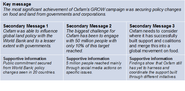
How to transform evaluation findings into infographics
I wrote recently on using infographics for evaluation – and just recently I came across an excellent post from Joitske Hulsebosch on the BetterEvaluation blog on how to transform evaluation findings into infographics – also providing some hints on software you can use yourself. And l love this – an inforgraphic from Elissa Schloesser on how to create infographics! (click on it to see it bigger).
![]()