Infographics to present evaluation findings
August 7, 2018 at 8:53 am 2 comments
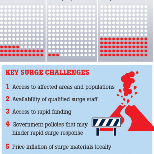
I’ve posted previously about using infographics to summarise evaluation findings; here is a recent example of using an infographic to present research results (click on the image to see larger and complete version); admittedly we packed a lot into this infographic – but still a good summary!
Entry filed under: communicating evaluation results, General.
2 Comments Add your own
Leave a comment
Trackback this post | Subscribe to the comments via RSS Feed

1. Karsten Weitzenegger | August 13, 2018 at 8:21 am
Reblogged this on Monitoring & Evaluation & Learning.
2. Using infographics to present evaluation findings | intelligent measurement | February 11, 2019 at 3:33 pm
[…] written previously about using infographics to summarise evaluation findings; here is another recent example of where my evaluation team used an infographic to present the […]