Posts filed under ‘communicating evaluation results’
New online hub – learnings from the IF campaign
Bond (UK NGO body) have created an online hub of campaigning effectiveness resources based on the lessons and recommendations of their IF campaign.
More than 30 individuals have shared their expertise in 7 areas of coalition campaigning to produce some 20 resources. They give top tips, reflections and ideas on topics ranging from digital campaigning to how to structure coalition campaigns. In addition you’ll also find interesting campaigning tools to assist with common campaigning issues.
The “Inspiration” mini-cases are particularly interesting for those working on campaigning and seeking to learn what “works” for others.
Using video for evaluation baseline
I’ve written before about using video for data collection and reporting evaluation results – but I’ve just come across this interesting example of using video for a baseline, that is to record the situation before the project starts.
Miki Tsukamoto of the the International Federation of Red Cross and Red Crescent Societies explains this approach on the AEA365 blog which they used for a project in Uganda. A summarised version of the resulting video is found below. They will return in 2017 to make an “endline” video – so stand-by!
How to transform evaluation findings into infographics
I wrote recently on using infographics for evaluation – and just recently I came across an excellent post from Joitske Hulsebosch on the BetterEvaluation blog on how to transform evaluation findings into infographics – also providing some hints on software you can use yourself. And l love this – an inforgraphic from Elissa Schloesser on how to create infographics! (click on it to see it bigger).
![]()
10 evaluation infographics
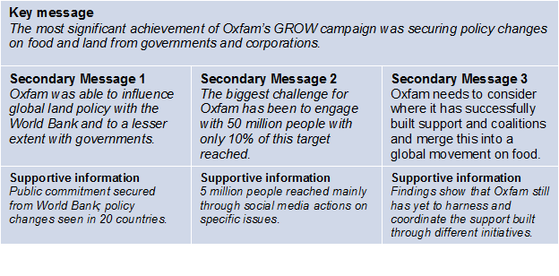
Infographics are visual images used to represent information and/or data. Increasingly we see infographics used to communicate key evaluation findings. It can be an excellent tool to communication key findings quickly and to reach diverse audiences. The presentation below contains 10 evaluation infographic that I’ve collated from various evaluations. I think these examples show the different possibilities and options for how you can use this tool to communicate key findings.
(disclaimer – I’ve been involved in one of the evaluations featured – that done by Oxfam)
5 resources on communicating evaluation results
I had the pleasure last week to run a workshop for 2 days in Berne, Switzerland on the theme Integrating Communication in Evaluation organised by the Swiss Evaluation Society and LAUCO Training and Evaluation. In my research for the workshop, I discovered some new resources on communicating evaluation results, here are a selection:
4. Communicating and Reporting on an Evaluation – from the American Red Cross & CRS (2008), (pdf) >>
5. Tips for delivering negative results (blog post – J. Sinclair), 2013 >>
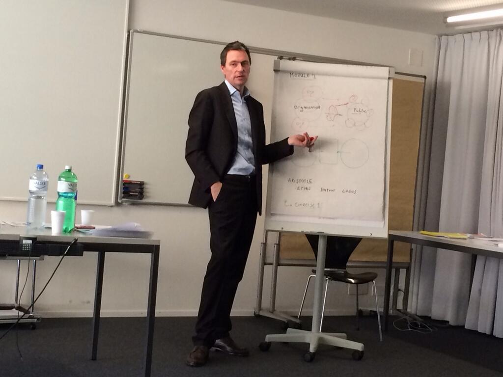
This photo from Patricia Goldschmid of myself explaining some points at the workshop – thanks again for all the participants for making it such an enjoyable experience!
Glenn
Integrating Communication in Evaluation workshop, Berne 2014 – registrations open
1) Integrating Communication in Evaluation
Using video in evaluation
The Better Evaluation blog has published a series of posts focusing on the use of video in evaluation:
– Participatory Video as a tool to engage communities and stakeholders in evaluation by Soledad Muniz
– Learning about evaluation from the inside using video by Paul Barese
– Using video to communicate evaluation findings by Glenn O’Neil (this writer)
Data visualization – tips for evaluation reports
For those who use graphs in evaluation reports and other documents, here is an excellent presentation from Ann K. Emery of the Innovation Network – well worth a look!
Presenting evaluation findings – Using Prezi
I’ve written before about the challenges of presenting evaluation findings – and the need to find creative ways to present findings. No doubt many readers would have already come across Prezi, a new presentation software that you see used often these days. I’ve recently worked on a research project for the Joint Standards Initiative where we presented our research results in a Prezi as you can see displayed below. It is allows the results to presented in visually appealing way and I believe communicates well the main points.
This Prezi was produced by Peter from YourPrezi.
