Posts filed under ‘Evaluation methodology’
Research in communication projects
I came across this useful table from the Devcom blog which explains how research can be used at different stages of communication projects. There are many elements that will be familiar to readers, but what caught my eye was the first method “audience analysis” – which is often ignored by communicators in their rush to create materials and campaigns. The blog also has an example of an audience analysis (pdf) for readers. And method 3 – pretesting of prototype material – is another step often skipped over.
|
Method |
Purpose |
|
1. Audience analysis |
To characterize audience (demographics, communication environment) to develop content of materials, set campaign targets |
|
2. Baseline survey |
To assess knowledge, beliefs and behavior – to document current scenario |
|
3. Pretesting of prototype materials |
To determine appeal, understandability of materials (radio drama, campaign materials) |
|
4. Management monitoring survey |
To track implementation plans and make adjustments as needed |
|
5. Content analysis |
To analyze the content of audience feedback |
|
6. Post-test survey |
To determine whether the project has achieved its objectives |
From broad goals to specific indicators
 No doubt you have heard of the Millenium Development Goals (MDGs), eight broad goals on poverty, ill-health, etc, agreed upon by all countries to try and reach by 2015.
From a monitoring and evaluation point-of-view, what is interesting is that these goals are broad sweeping statements, such as:
Goal 1: Eradicate Extreme Hunger and Poverty
Goal 3: Promote Gender Equality and Empower Women
One could ask – how can these broad goals be possibly monitored and evaluated?
As detailed on this MDGs monitoring website, what has been done is to set specific indicators for each goal, for example:
Goal 3: Promote Gender Equality and Empower Women
Description: Eliminate gender disparity in primary and secondary education, preferably by 2005, and in all levels of education no later than 2015
Indicators:
3.1 Ratios of girls to boys in primary, secondary and tertiary education
3.2 Share of women in wage employment in the non-agricultural sector
3.3 Proportion of seats held by women in national parliament
So from broad goals, the MDGs focus on two to seven specific indicators per goal that they are monitoring. That’s an interesting approach, as often we see broad goals set by organisations and then no attempt made to actually detail any indicators.
the MDGs monitoring website plays an active role in monitoring these indicators combining quantitative data (statistics) and qualitative data (case studies) – also an interesting approach to show how such indicators can be tracked.
Glenn
Evaluating communication products
Organizations spend millions on communication products every year. Brochures, annual reports, corporate videos and promotional materials are produced and distributed to a wide variety of audiences as part of broader communication programmes or as “stand alone” products.
However, working with many different types of organizations, I’ve noticed that little systematic follow-up is undertaken to evaluate how these products are used and what is their contribution to achieving communication or organizational goals.
I recently worked on a project where did just that – we evaluated specific communication products and attempted to answer the following questions:
- Is the product considered to be of high quality in terms of design and content?
- Is the product targeted to the right audiences?
- Is the product available, accessible and distributed to the intended target audiences?
- Is the product used in the manner for which it was intended – and for what other unintended purposes?
- What has the product contributed to broader communication and organizational goals?
- What lessons can be learnt for improving future editions of the product and design, distribution and promotion in general?
The results were quite interesting and surprising. We were also able to map out the use of a given product, like in this example:
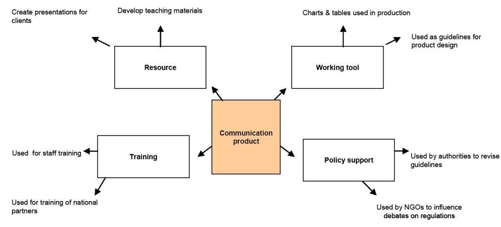
You can read more about this approach in this fact sheet (pdf) >>
Glenn
Found verses manufactured data

In evaluation projects, we often feel the strong need to talk to people – to assess a situation or judge a phenomena by surveying or interviewing people. However, this is “manufacturing” data – we are framing questions and then putting them to people – and perhaps in doing so are influencing how they respond.
Alternatively, there is a lot to say for “found” or “natural” data – information that already exists – e.g. media reports, blog posts, conference papers, etc. We often forget about this type of data in our rush to speak to people.
Take this example. I recently saw a paper presenting “current challenges in the PR/communications field”. After surveying PR/comm. professionals, a list of five current challenges were presented by the authors. This is “manufactured” data. An approach using “found” data would be to examine recent PR/comm. conference papers and see what challenges are spoken about – or study the websites of PR/comm. agencies and see what they are presenting as the main challenges.
Another example. Imagine you would like to study the experiences of US troops in Iraq. Of course you could survey and interview military personnel. However, a rich body of data certainly exists online in blog posts, videos and photos from military personnel describing their experiences.
Of course, there are limitations to using “found” data (such as it may present only the views of a select part of a population/phenomena) – but an evaluation project combining both “manufactured” and “found” would certainly make its findings more solid.
Examples of “found” data:
- blog posts
- discussion forums
- websites
- website statistics
- photo/video archives (online or offline)
- media reporting
- conference papers
- policy documents
- records (attendance, participation, complaints, sales, calls, etc.)
If you are interested to read further on this subject, this book “A Very Short, Fairly Interesting and Reasonably Cheap Book about Qualitative Research” by David Silverman provides more examples and information on this concept.
Glenn
Granularity – who cares?

Well I do, actually – granularity is more important than we think for many fields…no, it’s not some sort of breakfast cereal- it’s the size or scale that characterizes an object or activity. And often we see errors made in placing activities at the same level that are not actually at the correct level … An example – I recently noticed a survey that featured the following question:
In which region are you working?
– Sub-Saharan Africa
– North Africa and Middle East
– Europe
– South Asia
– East Asia
– Russia and North Asia
– China
– North America
– Central and South America
– Australasia and Japan
– UK
– Other region
The problem is that the countries and regions mentioned are at different levels – and this is a problem of granularity. “UK” and “China” are not at the same level as “Central and South America” and “South Asia”. This creates problems for people completing the survey – If I live in the UK what do I select? UK or Europe? Both are correct.
In this example, there would be three possible solutions; 1) list all countries of the world using an ISO standard list, 2) list countries applicable to the project (using “other country” for those exceptions that will certainly arise) or 3) use broad, widely accepted regions, such as Europe, Asia, Africa, etc. These solutions resolve the issue of granularity by placing the countries/regions at the same level.
It may seem banal but if these issues are not resolved before the questions are asked, the analysis will prove difficult. This is just one example – granularity is important for many fields such as information management (libraries), website design, software and retail (you never see supermarket aisles marked “vegetables, cereals, bananas” do you?)
Glenn
Likert scale & surveys – best practices

I’ve been looking into the best practices for using the Likert scale type of question, probably the most widely used response scale featured in surveys – often used to measure attitudes and other factors (e.g. “Excellent” to “Poor”). Created by Rensis Likert (pictured above) in the 1930s, his original scale featured five points. Over time, there has been many discussions and disagreements focused on one central question: What works best with the Likert scale to give you the most accurate responses?
I have read a number of studies on this question (sorry, I don’t link to them as they are all books or academic journals (that require a fee) but if you are interested write to me and I’ll give you the references) and the following are the points that most (but not all) scholars agree on:
More than seven points on a scale are too much. Studies show that people are not able to place their point of view on a scale greater than seven. So go for seven or less. What is the perfect number? Studies are not conclusive on this, most commonly mentioned are five, four or three point scales.
Numbered scales are difficult for people. For example, scales that are marked “1 to 5, with 5 being the highest” result in less accurate results than scales with labels such as “good” or “poor”. If numbered scales are used, signposts are recommended (e.g. put “poor” above 1, “satisfactory” above 3 and “excellent” above 5).
Labelled scales need to be as accurate as possible. Commonly uses labels such as “often” or “sometimes” often result in inaccurate responses. As these terms mean different notions of engagement from person to person, culture to culture (not to add the complexity of translating these terms). Scholars recommend using time-bound labels for frequency measures such as “once a week” (although problems of correct recall are also an issue). In addition, studies show that people find it difficult to differentiate between “very good” and “good” – better to use “good” and “excellent”.
And that’s it! Basically, there are inconclusive results on the use of a middle or neutral point (e.g. four point vs. a five point scale). Some scholars advocate a five point scale where respondents can have a “neutral” middle point whereas others prefer to “force” people to select a negative or positive position with a four point scale. In addition, the use of a “don’t know” option is inconclusive. I personally believe that a “don’t know” option is essential on some scales where people may simply not have an opinion. However, studies are inconclusive on if a “don’t know” option increases accuracy of responses.
Further information on the Likert Scale:
Examples of commonly-used Likert Scales >>
More examples of commonly-used Likert Scales >>
Glenn
Checklists and evaluation

Often in evaluation, we are asked to evaluate projects and programmes from several different perspectives: the end user, the implementer or that of an external specialist or “expert”. I always favour the idea that evaluation is representing the *target audiences* point of view – as is often the case in evaluating training or communications programmes – we are trying to explain the effects of a given programme or project on target audiences. However, often a complementary point of view from an “expert” can be useful. A simple example – imagine if you making an assessment of a company website – a useful comparison would be comparing the feedback from site visitors with that of an “expert” who examines the the website and gives his/her opinion.
However, often opinions of “experts” are mixed in with feedback from audiences and comes across as unstructured opinions and impressions. A way of avoiding this is for “experts” to use checklists – a structured way to assess the overall merit, worth or importance of something.
Now many would consider checklists as being a simple tool not worthy of discussion. But actually a checklist is often a representation of a huge body of knowledge or experience: e.g. how do you determine and describe the key criteria for a successful website?
Most checklists used in evaluation are criteria of merit checklists – where a series of criteria are established and given a standard scale (e.g. very poor to excellent) and are weighed equally or not (e.g. one criteria is equal or more crucial than the next one). Here are several examples where checklists could be useful in evaluation:
- Evaluating an event: you determine “success criteria” for the event and have several experts use a checklist and then compare results.
- Project implementation: a team of evaluators are interviewing staff/partners on how a project is being implemented. The evaluators use a checklist to assess the progress themselves.
- Evaluating services/products: commonly used, where a checklist is used by a selection panel to determine the most appropriate product/services for their needs.
This post by Rick Davies actually got me thinking about this subject and discusses the use of checklists in assessing the functioning of health centres.
Glenn
Cause and effect – goal?

I recently came across a short article in a London newspaper which I summarise as following:
On Friday 21 September, Jose Mourinho, coach of the UK Chelsea football team resigned. On this day, a jump was seen in the number of people visiting a certain job vacancies website. It was proposed by the website marketing team that this jump was due to people learning of Mr Mourinho’s resignation and prompting them to think about changing careers and looking for a new opportunity – thus the rise in number of visits to the job vacancies website.
Doesn’t that strike you as a slightly spurious claim of cause and effect? They appear to be connecting the unrelated and proposing a series of changes that seem slightly unlikely: 1) a change to knowledge (knowing that Chelsea’s coach resigns) to 2) change to attitude (I should change jobs) to 3) behaviour (I actively look for a new job). Possibly of even more concern is that there are no alternative explanations offered as to the jump in website visitors. We can imagine several alternative explanations:
– On Fridays there is always a jump in website visitors (like patterns often seen in purchasing or visits to museums).
– A publicity campaign, a change is site referencing or link campaign drove more visitors to the website on that day.
– Or the more mundane, a technician installed a new monitoring software on the website that led to a more accurate or inaccurate reporting of website visitors.
In addition, no comparison was given to traffic on other job vacancies websites or even global statistics of web traffic (perhaps all sites experienced a jump on 21 September?)
Thinking it through, I think it’s safe to say that there is not enough evidence to point to an association between the resignation of Chelsea’s coach and the jump in visitors to a job vacancies website. The cause (resignation) does seem very distant from the effect (people seek to change jobs). We can point to other cases where an association does seem to exist between a public event and a particular change in behaviour as I’ve written about before: the effect of a reality TV program on the number of people willing to donate an organ and the effect of Kylie Minogue’s treatment for breast cancer on the number of young women taking a scan appointment. In both cases, an association between the cause and effect could be demonstrated and alternative causes were ruled out.
Glenn
Sharpening the focus on measurement

It is often difficult to get organisations away from simply measuring “outputs” – what is produced – to measuring “outcomes” – what are the effects of outputs.
Funny enough, many organisations want to go from the very superficial measuring of output (e.g. how many news articles did we generate) to the very in-depth measuring of impact (e.g. the long term effect of our media visibility on audiences). Impact is feasible but difficult to measure, as I’ve written about before. However, instead of focusing on the two ends of the measurement scale, organisations would perhaps be wise to focus on “outcome” measurement.
I think this quote from a UN Development Programme Evaluation Manual (pdf) sums up why outcome is an appropriate level to measure for most organisations:
“Today, the focus of UNDP evaluations is on outcomes, because this level of results reveals more about how effective UNDP’s actions are in achieving real development changes. A focus on outcomes also promises a shorter timeframe and more credible linkages between UNDP action and an eventual effect than does a focus on the level of overall improvement in people’s lives, which represent much longer-term and diffuse impacts .”
The notion of the shorter timeframe and more credible linkages is certainly appealing for many organisations considering their focus of evaluation.
Glenn
Impact – how feasible for evaluation?

As I mentioned in an earlier post, people often confuse “impact” with “results”. Is it possible to measure “long term impact” of projects? It is, however for most projects it is unrealistic to do so for two reasons: time and cost.
To evaluate impact, you would usually need to wait some 12 months after the major elements of a project have been implemented. Many organisations cannot simply wait that long. In term of costs, an impact study requires a triangulation methodology that uses various quantitative and qualitative research methods which could be costly. However, if time and cost are not issues, an impact evaluation is possible, keeping in mind the following points:
Was the impact desired defined at the beginning of the project?
For example, greater organisation efficiency; change in the way a target audience and/or an organisation behaves; or improvements in how services for a given audience are managed?
What have been the other elements influencing the impact you want to measure?
Your project cannot be viewed in isolation; there must have been other factors influencing the changes being observed. Identifying these factors will help you to assess the level of influence of your project compared to other factors.
Do you have a mandate to measure impact?
When assessing impact, you will be looking at long term effects that probably go outside of your own responsibilities and into the realms of other projects and units – you are looking at an area of the wider effects of your organisation’s activities and this needs to be taken into consideration. For example, if you are looking at the longer term effects of a training program, you would want to look at how individuals and the organisation as a whole are more efficent as a result of the training. Do you have the political mandate to do so? – As you may discover effects that go way beyond your own responsibilities.
Evaluating impact is a daunting but not impossible task. For most projects, it would be more realistic to focus on measuring outputs and preferably outcomes – and think of short term outcomes as I have written about previously.
Glenn
