Posts filed under ‘Evaluation tools (surveys, interviews..)’
Hints on interviewing for evaluation projects

Evaluators often use interviews as a primary tool to collect information. Many guides and books exist on interviewing – but not so many for evaluation projects in particular. Here are some hints on interviewing based on my own experiences:
1. Be prepared: No matter how wide-ranging you would like an interview to be, you should as a minimum note down some subjects you would like to cover or particular questions to be answered. A little bit of structure will make the analysis easier.
2. Determine what is key for you to know: Before starting the interview, you might have a number of subjects to cover. It may be wise to determine what is key for you to know – what are the three to four things you would like to know from every person interviewed? Often you will get side-tracked during an interview and later on going through your notes you may discover that you forgot to ask about a key piece of information.
3. Explain the purpose: Before launching into questions, explain in broad terms the nature of the evaluation project and how the information from the discussion will be used.
4. Take notes as you discuss: Even if it is just the main points. Do not rely on your memory as after you have done several interviews you may mix up some of the responses. Once the interview has concluded try to write further on the main points raised. Of course, recording and then transcribing interviews is recommended but not always possible.
5. Take notes about other matters: It’s important also to note down not only what a person says but how they say it – you need to look out for body language, signs of frustration, enthusiasm, etc. Any points of this nature I would normally note down at the end of my interview notes. This is also important if someone else reads your notes in order for them to understand the context.
6. Don’t offer your own opinion or indicate a bias: Your main role is to gather information and you shouldn’t try to defend a project or enter into a debate with an interviewee. Remember, listening is key!
7. Have interviewees define terms: If someone says “I’n not happy with the situation”, you have understood that they are not happy but not much more. Have them define what they are not happy about. It’s the same if an interviewew says “we need more support”. Ask them to define what they mean by “support”.
8. Ask for clarification, details and examples: Such as “why is that so?”, “can you provide me with an example?”, “can you take me through the steps of that?” etc.
Hope these hints are of use..
Glenn
Likert scales, frequency and Woody Allen

![]()
We often see survey questions with likert scales using frequency estimations such as “sometimes”, “often”, “always”, “never”. etc. However, these scales often provide inaccurate responses as I’ve written about before. Why is that so? Well, describing frequency differs enormously from person to person. This dialogue of a couple seeing separate analysts about their relationship, taken from the Woody Allen film “Annie Hall” illustrates this point:
Woody’s analyst: How often do you sleep together?
Woody Allen: Hardly ever! Maybe three times a week
Diane’s analyst: Do you have sex often?
Diane Keaton: Constantly! I’d say three times a week
So “three times a week” for one person is “constantly” and “hardly ever” for another! This funny dialogue illustrates the point that descriptive terms (e.g. “constantly”) are not accurate measures of frequency.
In survey questions, one way to avoid this is by not using descriptive terms and asking people directly to provide a numerical estimate, for example:
Inaccurate: How often do you watch TV?
Never, hardly ever, sometimes, constantlyAccurate: How many hours per week do you watch TV?
None, under 5, 6-10, 11-15, 16-20, more than 20
Of course, such numeric scales also have problems of accuracy – e.g. people can recall incorrectly how many hours they have spent watching TV. In this regard, it is better to focus on shorter time periods (“what have you done in the past week” or “what do you do on an average day”).
Glenn
Seven tips for better email invitations for web surveys

Further to my earlier post on ten tips for better web surveys, the email that people receive inviting them to complete an online survey is an important factor in persuading people to complete the survey – or not. Following are some recommended practices and a model email to help you with this task:
1. Explain briefly why you want an input: it’s important that people know why you are asking their opinion or feedback on a given subject. State this clearly at the beginning of you email, e.g. “As a client of XYZ, we would appreciate your feedback on products that you have purchased from us”.
2. Tell people who you are: it’s important that people know who you are (so they can assess whether they want to contribute or not). Even if you are a marketing firm conducting the research on behalf of a client, this can be stated in the email as a boiler plate message (see example below). In addition, the name and contact details of a “real” person signing off on the email will help.
3. Tell people how long it will take: quite simply, “this survey will take you some 10 minutes to complete”. But don’t underestimate – people do get upset if you tell them it will take 10 minutes and 30 minutes later they are still going through your survey…
4. Make sure your survey link is clickable: often survey softwares generate very long links for individual surveys. You can often get around this by masking the link, like this “click to go to survey >>“. However, some email systems do not read correctly masked links so you may be better to copy the full link into the email as in the example below. In addition, also send your email invitation to yourself as a test – so you can click on your survey link just to make sure it works…
5. Reassure people about their privacy and confidentiality: people have to be reassured that their personal data and opinions will not be misused. A sentence covering these points should be found in the email text and repeated on the first page of the web survey (also check local legal requirements on this issue).
6. Take care with the “From”, “To” and “Subject”: If possible, the email address featured in the “From” field should be a real person. The problem will be if your survey comes from info@wizzbangsurveys.net it may end up in many people’s spam folders. For the “To”, it should contain an individual email only – we still receive email invitations where we can see 100s of email addresses in the “To” field – it doesn’t really instill confidence as to how your personal data will be used. The “Subject” is important also – you need something short and straight to the point (see example below). Avoid using spam-catching terms such as “win” or “prize”.
7. Keep it short: You often can fall into the trap of over explaining your survey and hiding the link somewhere in the email text or right at the bottom. Try and keep your text brief – most people will decide in seconds if they want to participate or not – and they need to be able to understand why they should, for whom, how long it will take and how (“Where is the survey link?!).
Model email invitation:
From: j.jones@xyzcompany.net
To: glenn.oneil@gmail.com
Subject: XYZ Summit 2008 – Seeking your feedbackDear participant,
On behalf of XYZ, we thank you for your participation in the XYZ Summit.
We would very much appreciate your feedback on the Summit by completing a brief online survey. This survey will take some 10 minutes to complete. All replies are anonymous and will be treated confidentially.
To complete the survey, please click here >>
If this link does not work, please copy and paste the following link into your internet window:
http://optima.benchpoint.com/optima/SurveyPop.aspx?query=view&SurveyID=75&SS=0ZJk1RORbThank you in advance; your feedback is very valuable to us.
Kind regards,
J. Jones
Corporate Communications
XYZ Company
email: j.jones@xyzcompany.net
tel: ++ 1 123 456 789****
Benchpoint has been commissioned by XYZ to undertak this survey. Please contact Glenn O’Neil of Benchpoint Ltd. if you have any questions: oneil@benchpoint.com
The following article from Quirks Marketing Research Review also contains some good tips on writing email invitations.
Glenn
10 tips for better web surveys

An advantage of the Internet age is that it is much easier to undertake surveys by using online web services that are relatively inexpensive. A disadvantage is that the quality of many web surveys are questionable. To help you write better web surveys, following are ten tips for better web surveys drawn from years of experience:
1. Explain why: When receiving an invitation (often by email) to complete a web survey, the respondents must understand why they are being asked to fill out the survey. You need to clearly state the purpose of the survey and how the results will be used. This can usually be stated in one to two sentences, e.g. “This survey is to collect your thoughts on the seminar you attended yesterday. Your feedback will help us to improve future events”.
2. Promise confidentiality: Most people will respond to your survey if they know their personal details and opinions will not be shared with the whole worldwide web. If needed, you can ask demographic questions such as age, education, country of residence and income but these need to be phrased sensitively (e.g. for age, ask for the year of birth and for salary offer a range e.g. “do you earn between $40,000 – 50,000, 51,000 – 60,000, etc.”). On your email invitation and first page of your survey you need to reassure respondents of confidentiality and anonymity. A simple sentence will do, such as “All feedback provided is anonymous and will be treated confidentially”.
3. Tell people how long it will take: Often people get frustrated completing surveys as they don’t know how long it will take. It is better to state up front in the email invitation how long the survey will take, such as “This survey will take some 10 minutes to complete”. In addition, within the survey, you should activate the progress meter feature (which most online survey systems have), that shows respondents how much of the survey they have completed often with a small graph, e.g.: “30% of the survey completed”.
4. Keep it short: People often abandon surveys because they are too long. A good rule of thumb is that if you go over 25 questions you are asking quite a lot of respondents. Of course it depends on your subject and the potential respondents: if the subject is important to people they will spend more time responding to the survey.
5. Vary the type of questions: Many web surveys often ask use the same type of question repeatedly, such as using a scale “poor to excellent” with a long list of subjects to check off. This can induce survey fatigue where the respondents simply click down the columns vertically (e.g. they choose “good” for every subject) just to complete the survey. If possible, question types should be varied in order to avoid such a problem.
6. Always include at least one open question: These are questions where people can type in their own responses. Often web surveys only have closed questions where respondents check off the answers. Open questions, although requiring more time for analysis, often provide much more in-depth feedback and some insight into the “how” and “why”. If you are not sure how to place an open question in a survey, add one at the end of the survey requesting comments, such as “This survey has been about XYZ. Do you have anything else you would like to add?”
7. Place demographic questions last: To be able to make some useful analysis of the data you collect, you will need to collect some demographic data – in most cases this would be the country/state of residence and type of work as a minimum. These questions should be placed at the end of the survey by which time respondents will feel more comfortable answering such questions. This is even more important for questions on more sensitive demographic information such as age, income and ethnic background.
8. “Other” may be your most useful response: When providing respondents with a pre-defined list of responses (e.g. what type of work do you do? Legal, finance, IT, PR, etc.), include an “Other, please specify_____” option. This helps to clarify if your pre-selected responses covered all possible answers and you may well be surprised by new groups of responses placed in “Other” that emerge.
9. Always give people a way out if they can’t answer: Sometimes in a survey you will arrive at a question with pre-defined responses and you will think “well, none of these apply to me”. Respondents are then forced to select a false response. Always read through your questions and imagine the range of responses possible. If in doubt, place a “none of the above” or “Not applicable” as a possible response for questions with pre-defined responses.
10. Always email invitations on a Tuesday – and send a reminder: Studies show that email invitations that are sent on a Tuesday will more likely be opened than on other days. It is also important to send a reminder – say 10 days after the initial invitation – if you can filter out those respondents that have already responded all the better. Further, our experience shows that you can double your response rate with an email reminder.
And here are 20 more tips on writing better web surveys from Userfocus>>
Glenn
Using graphs and diagrams to explain
I recently had a discussion with a colleague about how we should represent the findings of an evaluation study. I am a big fan of using graphs and diagrams to explain the findings – as they say a “picture tells a thousand words”.
But we often see many misuses of graphs and diagrams that can provide an incorrect idea for the reader. I came across an example from a report recently which I have reproduced here:
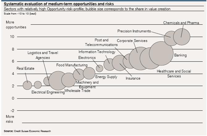
This is an interesting example of a pictogram or scatter chart to represent two variables: 1) level of opportunity/risk (vertical scale) and 2) size of share value (size of bubbles).
But examing this chart, it made me wonder – what does the horizontal scale represent? In other words, on what basis are the bubbles placed left to right? I cannot see any logical basis in the chart for the horizontal location of the bubbles. I think that’s unfortunate as such a chart could use the horizontal scale to reinforce the share value variable or distribute the bubbles on another basis (e.g. sector of interest).
For those interested in graphic presentation of information, some key texts to read are found on the website of Edward Tufte, a leading specialist in this area.
Glenn
Analyzing open-ended questions
In an earlier post, I wrote about the advantages of using open-ended questions in surveys. The challenge is once you have 100s (or 1000s) of responses from your target audience – how do you analyze the answers to open-ended questions?
Basically, we draw on techniques developed for analyzing qualitative data – we are looking for patterns and trends in the responses so we can reach some conclusions as to what we are seeing. I summarise the main steps that I would usually undertake:
1. Read through the responses.Yes, as laborious as it may seem, you must read through each response to get a feeling for the data. As you read through the responses, you will probably see some common themes emerging.
2. Create response categories. The second step is to develop categories for the different themes you are seeing. For example, with a question asking for people’s feedback on a website, you will probably be able to group comments into categories such as “content”, “design”, “features”, “service”, etc.
3. Label each comment with one or several categories. As you read through the comments, assign at least one category to each response. This is what is called “coding” and best done in an excel sheet with responses in one column and your category (s) in the next column.
4. Look at what you have. In the example about feedback for a website, you might label half of your responses as “content”. You can then divide the responses on “content” into smaller categories, e.g. “corporate content”, “product content”, etc. By doing this you will start to see what are the trends in the data and the main issues raised by your respondents.
5. Think what are the responses about? Once you have categorised and coded data, it doesn’t do you much credit just to say “some half of people spoke about content; most of these people spoke about the corporate pages on the website”. You must be able to explain what is being said about the subject or theme. For example in the case of “content” – what were people saying about content? Imagine if a respondent said:
“I consult regularly the corporate pages. This information is well-presented but not up-to-date. I never seem to be able to find information on latest priorities and management profiles”
This example contains different comments on aspects related to design, site updating, navigation and missing content. Notice that the comment on navigation is actually not a “content” issue – but would be considered as a “design” issue and needs to be coded accordingly.
6. Identifying the patterns and trends: once the data has been studied and categories determined, the next step is to see what categories are related and where can trends and patterns be identified: are there common themes emerging? Or are there a series of unrelated points being mentioned?
7. Writing up the analysis: Once you have analyzed the data and identified the major patterns and trends your next step is to write a summary of what you have found. This would normally be a descriptive text incorporating comments directly from the respondents. For example:
“In providing feedback on the website, some half of the respondents spoke about content. The main issues raised included the inability to find content and the lack of up-to-date content on management themes. To a lesser extent, the high quality of the product information and the desire for more information on the management team were mentioned. The following comment from a respondent illustrates these points:
“I find the quality of the product information very good. However, the information is often difficult to find and is hidden on the website”.
As you see, I use terms such as “some half”, “main issues” and “to a lesser extent” to illustrate the magnitude of the trends identified. Some prefer to transfer such an analysis into quantifiable terms – such as “some 50%” or “under 30%”. I prefer not to – but if you are dealing with very few responses, it’s better to mention the precise numbers such as “5 out of 20 responses preferred…”.
Good luck with your analysis!
Glenn
writing open-ended questions

Having previously written about best practices for using likert scale questions in surveys, I’d like to say something in favour of using open-ended questions. An open-ended question allows respondents to answer a question in their own words. In web surveys, this involves having a text field/box where respondents can write in their answer to a question posed.
Open-ended questions have the advantage over close-ended questions (that use pre-defined answers, such as “good”, “excellent”, etc.) in that they provide an insight into the “how” and “why” aspects of an issue. Close-ended questions typically answer the “how much/many” and “when” aspects.
In my opinion, a survey should contain at least one open-ended question. Imagine if you are asking people about a product and they have to rate it on a satisfaction scale. It would be very interesting to go behind the numbers and ask them “describe for me the two major advantages of using this product”. Matched to your satisfaction scale (take particular note of what the very satisfied and very unsatisfied customers are answering), this information is highly valuable.
I also advocate finishng a survey with an open-ended question, such as “This survey has been about your experience with XYZ product. Do you have anything else you would like to say?”.
You would be surprised at the number of people that do have something to say! I am always told that people don’t like to give feedback; they are fed-up with answering surveys. But my experience has shown that if you really are interested in an issue / product / service / company, you will give a feedback – open-ended questions are perfect for that.
Of course, the downside is how do you analyse the answers you get? How can you draw useful actionable points from the answers? That’s another story that I’ll cover in my next post…
In the meantime, here is a good summary of best practices for open-ended questions>>
Glenn
The magical number seven, plus or minus two

In an earlier post on best practices for likert scale questions, I made reference to an article “The Magical Number Seven, Plus or Minus Two: Some Limits on Our Capacity for Processing Information”. A reader pointed out to me that this is one the most famous social psychology articles (by George A. Miller, 1956).
A main conclusion of the article is that most people can only deal with seven ideas at a time. Very clever people can manage up to nine and less skilled people may only be able to concentrate on five ideas at once.
Putting this theory into practice, I can see plenty of examples which call out for the “seven point limit”, such as:
- Number of chapters in a report
- Number of recommendations in reports (if there are more than seven then they should be broken down under sub-headings)
- Number of points on a likert scale question (see my previous post on this)
- Lists of variables/aspects that must be ranked/rated on surveys (e.g. “please rate the following aspects of the website..”)
- Items on a checklist to be assessed (see my previous post on checklists)
And that’s only five ideas so us less skilled people can cope…
Glenn
Likert scale & surveys – best practices

I’ve been looking into the best practices for using the Likert scale type of question, probably the most widely used response scale featured in surveys – often used to measure attitudes and other factors (e.g. “Excellent” to “Poor”). Created by Rensis Likert (pictured above) in the 1930s, his original scale featured five points. Over time, there has been many discussions and disagreements focused on one central question: What works best with the Likert scale to give you the most accurate responses?
I have read a number of studies on this question (sorry, I don’t link to them as they are all books or academic journals (that require a fee) but if you are interested write to me and I’ll give you the references) and the following are the points that most (but not all) scholars agree on:
More than seven points on a scale are too much. Studies show that people are not able to place their point of view on a scale greater than seven. So go for seven or less. What is the perfect number? Studies are not conclusive on this, most commonly mentioned are five, four or three point scales.
Numbered scales are difficult for people. For example, scales that are marked “1 to 5, with 5 being the highest” result in less accurate results than scales with labels such as “good” or “poor”. If numbered scales are used, signposts are recommended (e.g. put “poor” above 1, “satisfactory” above 3 and “excellent” above 5).
Labelled scales need to be as accurate as possible. Commonly uses labels such as “often” or “sometimes” often result in inaccurate responses. As these terms mean different notions of engagement from person to person, culture to culture (not to add the complexity of translating these terms). Scholars recommend using time-bound labels for frequency measures such as “once a week” (although problems of correct recall are also an issue). In addition, studies show that people find it difficult to differentiate between “very good” and “good” – better to use “good” and “excellent”.
And that’s it! Basically, there are inconclusive results on the use of a middle or neutral point (e.g. four point vs. a five point scale). Some scholars advocate a five point scale where respondents can have a “neutral” middle point whereas others prefer to “force” people to select a negative or positive position with a four point scale. In addition, the use of a “don’t know” option is inconclusive. I personally believe that a “don’t know” option is essential on some scales where people may simply not have an opinion. However, studies are inconclusive on if a “don’t know” option increases accuracy of responses.
Further information on the Likert Scale:
Examples of commonly-used Likert Scales >>
More examples of commonly-used Likert Scales >>
Glenn
The value of checklists and evaluation: 7 reasons

Further to what I wrote last week about checklists and their use in evaluation, I have found an excellent article on the logic and methodology of checklists.
Dr Michael Scriven of the Evaluation Centre of Western Michigan University describes the different types of checklists and how good checklists are put together. In particular, I like his list of the seven values of checklists, of which I summarise as follows:
- Reduces the chance of forgetting to check something important
- Are easier for the lay stakeholder to understand and evaluate
- Reduces the “halo effect”- it forces an evaluator to look at all criteria and not be overwhelmed by one highly valued feature
- Reduces the influence of the “rorschach effect” – that is the tendancy to see what one wants to see in a mass of data – evaluators have to look at all dimensions
- Avoids criteria being counted twice or given too much importance
- Summarises a huge amount of professional knowledge and experience
- Assists in evaluating what we cannot explain
As Dr Scriven points out, checklists are very useful tools in getting us to think through the “performance criteria” of all kinds of processes, projects or occurences, e.g. what are the key criteria that make a good trainer – and what criteria are more important than other?
