conference evaluation and network mapping
Often we attend conferences where one of the stated objectives is “increase/build/create networking” and I always found it odd that there is never any attempt to measure if networking really took place.
A possible solution is to map networks created by participants at conferences – and compare these networks to those that existed before the conferences.
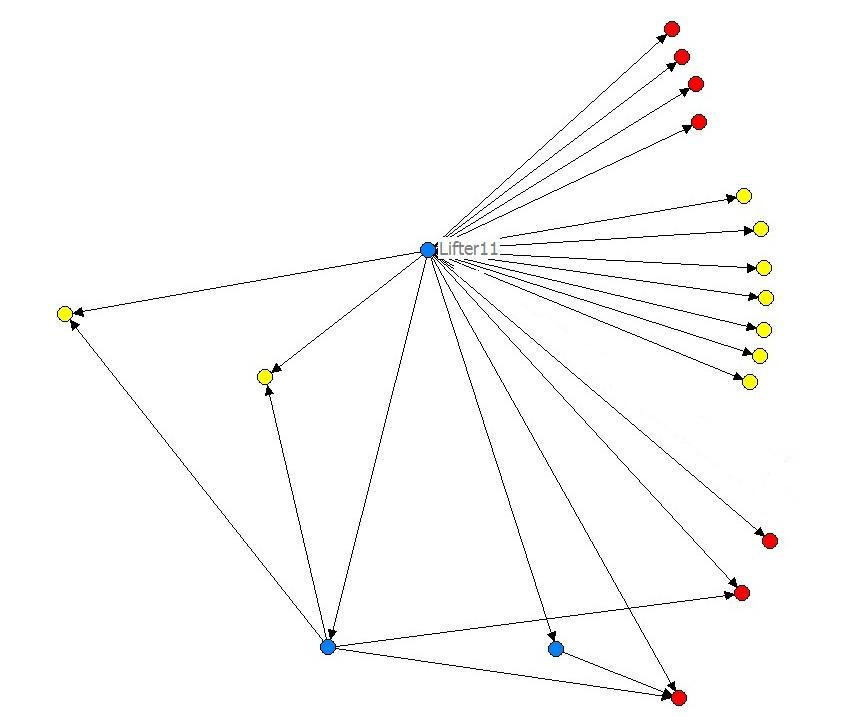
This is exactly what I have done recently in a network mapping study that you can view here (pdf – 1 MB) and the above image is from. From the LIFT conference of 2007, we mapped the networks of 28 participants (out of 450 total participants) before and after the conferences. We found some quite surprising results:
-
These 28 participants had considerable networks prior to the conference – reaching some 30% of all participants.
-
These networks increased after the conference -the 28 people were then connected to some 50% of all participants.
-
Based on the sample of 28 participants, most participants doubled their networks at LIFT07 – e.g. if you went to the conference knowing five people, you would likely meet another five people at the conference – thus doubling your network to ten.
Although this is only a mapping of 28 participants, it provides some insight into conferences and how networks develop – it’s also quite interesting that 28 people can reach 50% (225 people) of the total conference participants in this case.
View the full report here (pdf – 1 MB).
If you are after further information on network mapping, I recommend Rick Davies’ webpage on network mapping. Although it focuses on development projects it contains a lot of useful information on network mapping in general.
Glenn
Measuring social media

An interesting post from the Buzz Bin which provides a good summary of current thoughts on how to measure social media such as blogs, social networks and podcasts. Well worth a read…
Glenn
Granularity – who cares?

Well I do, actually – granularity is more important than we think for many fields…no, it’s not some sort of breakfast cereal- it’s the size or scale that characterizes an object or activity. And often we see errors made in placing activities at the same level that are not actually at the correct level … An example – I recently noticed a survey that featured the following question:
In which region are you working?
– Sub-Saharan Africa
– North Africa and Middle East
– Europe
– South Asia
– East Asia
– Russia and North Asia
– China
– North America
– Central and South America
– Australasia and Japan
– UK
– Other region
The problem is that the countries and regions mentioned are at different levels – and this is a problem of granularity. “UK” and “China” are not at the same level as “Central and South America” and “South Asia”. This creates problems for people completing the survey – If I live in the UK what do I select? UK or Europe? Both are correct.
In this example, there would be three possible solutions; 1) list all countries of the world using an ISO standard list, 2) list countries applicable to the project (using “other country” for those exceptions that will certainly arise) or 3) use broad, widely accepted regions, such as Europe, Asia, Africa, etc. These solutions resolve the issue of granularity by placing the countries/regions at the same level.
It may seem banal but if these issues are not resolved before the questions are asked, the analysis will prove difficult. This is just one example – granularity is important for many fields such as information management (libraries), website design, software and retail (you never see supermarket aisles marked “vegetables, cereals, bananas” do you?)
Glenn
More favourite quotes on evaluation and measurement

To add to my previous favourite quotes on evaluation and measurement, I have collected the following quotes – enjoy!:
“Everything that can be counted does not necessarily count; everything that counts cannot necessarily be counted”
Albert Einstein
“The most serious mistakes are not being made as a result of wrong answers. The truly dangerous thing is asking the wrong question”
Peter Drucker
“One of the great mistakes is to judge policies and programs by their intentions rather than their results”
Milton Friedman
“The pure and simple truth is rarely pure and never simple”
Oscar Wilde
“First get your facts; then you can distort them at your leisure”
Mark Twain
I know that half of my advertising dollars are wasted … I just don’t know which half”
John Wanamaker
Glenn
Analyzing open-ended questions
In an earlier post, I wrote about the advantages of using open-ended questions in surveys. The challenge is once you have 100s (or 1000s) of responses from your target audience – how do you analyze the answers to open-ended questions?
Basically, we draw on techniques developed for analyzing qualitative data – we are looking for patterns and trends in the responses so we can reach some conclusions as to what we are seeing. I summarise the main steps that I would usually undertake:
1. Read through the responses.Yes, as laborious as it may seem, you must read through each response to get a feeling for the data. As you read through the responses, you will probably see some common themes emerging.
2. Create response categories. The second step is to develop categories for the different themes you are seeing. For example, with a question asking for people’s feedback on a website, you will probably be able to group comments into categories such as “content”, “design”, “features”, “service”, etc.
3. Label each comment with one or several categories. As you read through the comments, assign at least one category to each response. This is what is called “coding” and best done in an excel sheet with responses in one column and your category (s) in the next column.
4. Look at what you have. In the example about feedback for a website, you might label half of your responses as “content”. You can then divide the responses on “content” into smaller categories, e.g. “corporate content”, “product content”, etc. By doing this you will start to see what are the trends in the data and the main issues raised by your respondents.
5. Think what are the responses about? Once you have categorised and coded data, it doesn’t do you much credit just to say “some half of people spoke about content; most of these people spoke about the corporate pages on the website”. You must be able to explain what is being said about the subject or theme. For example in the case of “content” – what were people saying about content? Imagine if a respondent said:
“I consult regularly the corporate pages. This information is well-presented but not up-to-date. I never seem to be able to find information on latest priorities and management profiles”
This example contains different comments on aspects related to design, site updating, navigation and missing content. Notice that the comment on navigation is actually not a “content” issue – but would be considered as a “design” issue and needs to be coded accordingly.
6. Identifying the patterns and trends: once the data has been studied and categories determined, the next step is to see what categories are related and where can trends and patterns be identified: are there common themes emerging? Or are there a series of unrelated points being mentioned?
7. Writing up the analysis: Once you have analyzed the data and identified the major patterns and trends your next step is to write a summary of what you have found. This would normally be a descriptive text incorporating comments directly from the respondents. For example:
“In providing feedback on the website, some half of the respondents spoke about content. The main issues raised included the inability to find content and the lack of up-to-date content on management themes. To a lesser extent, the high quality of the product information and the desire for more information on the management team were mentioned. The following comment from a respondent illustrates these points:
“I find the quality of the product information very good. However, the information is often difficult to find and is hidden on the website”.
As you see, I use terms such as “some half”, “main issues” and “to a lesser extent” to illustrate the magnitude of the trends identified. Some prefer to transfer such an analysis into quantifiable terms – such as “some 50%” or “under 30%”. I prefer not to – but if you are dealing with very few responses, it’s better to mention the precise numbers such as “5 out of 20 responses preferred…”.
Good luck with your analysis!
Glenn
writing open-ended questions

Having previously written about best practices for using likert scale questions in surveys, I’d like to say something in favour of using open-ended questions. An open-ended question allows respondents to answer a question in their own words. In web surveys, this involves having a text field/box where respondents can write in their answer to a question posed.
Open-ended questions have the advantage over close-ended questions (that use pre-defined answers, such as “good”, “excellent”, etc.) in that they provide an insight into the “how” and “why” aspects of an issue. Close-ended questions typically answer the “how much/many” and “when” aspects.
In my opinion, a survey should contain at least one open-ended question. Imagine if you are asking people about a product and they have to rate it on a satisfaction scale. It would be very interesting to go behind the numbers and ask them “describe for me the two major advantages of using this product”. Matched to your satisfaction scale (take particular note of what the very satisfied and very unsatisfied customers are answering), this information is highly valuable.
I also advocate finishng a survey with an open-ended question, such as “This survey has been about your experience with XYZ product. Do you have anything else you would like to say?”.
You would be surprised at the number of people that do have something to say! I am always told that people don’t like to give feedback; they are fed-up with answering surveys. But my experience has shown that if you really are interested in an issue / product / service / company, you will give a feedback – open-ended questions are perfect for that.
Of course, the downside is how do you analyse the answers you get? How can you draw useful actionable points from the answers? That’s another story that I’ll cover in my next post…
In the meantime, here is a good summary of best practices for open-ended questions>>
Glenn
The ultimate user test?

The new Terminal Five at Heathrow Aiport, London – which had quite a controversial birth – is going to undertake an unusual experience in “testing” there facilities before public launch. As I’ve written about before, the aspect of evaluation prior to the launch of a project or activity is often overlooked – and this is an extreme example of this principle in action.
Terminal Five is seeking 15,000 volunteers to act as test users of their new facilities. They will ask volunteers to act as “real” passengers and go through the steps of checking in just to stepping on to the aircraft. I find it fascinating that they will “test” their facilities in such a large-scale manner. Always recommended is “field testing” of new products and services – but this is going quite far. Of course, the question begs, what happens if the user testing brings up major issues with the terminal? Well, Terminal Five lists the following as their aim:
“What are we trying to achieve?: Proof that Terminal 5 is safe, secure and works like clockwork. We’ll also ensure the team who will be running the terminal get the chance to test and develop their service. We also need to identify anything we need to fix prior to opening”
So let’s see what such a trial will bring – how big will the “fixes” be – or will all work like clockwork? Regardless, I am sure they will receive interesting feedback and discover, as I have in usability testing, that people view and use products or facilities in ways totally unanticipated. Do you want to volunteer? Read more here>>
Glenn
The magical number seven, plus or minus two

In an earlier post on best practices for likert scale questions, I made reference to an article “The Magical Number Seven, Plus or Minus Two: Some Limits on Our Capacity for Processing Information”. A reader pointed out to me that this is one the most famous social psychology articles (by George A. Miller, 1956).
A main conclusion of the article is that most people can only deal with seven ideas at a time. Very clever people can manage up to nine and less skilled people may only be able to concentrate on five ideas at once.
Putting this theory into practice, I can see plenty of examples which call out for the “seven point limit”, such as:
- Number of chapters in a report
- Number of recommendations in reports (if there are more than seven then they should be broken down under sub-headings)
- Number of points on a likert scale question (see my previous post on this)
- Lists of variables/aspects that must be ranked/rated on surveys (e.g. “please rate the following aspects of the website..”)
- Items on a checklist to be assessed (see my previous post on checklists)
And that’s only five ideas so us less skilled people can cope…
Glenn
Likert scale & surveys – best practices

I’ve been looking into the best practices for using the Likert scale type of question, probably the most widely used response scale featured in surveys – often used to measure attitudes and other factors (e.g. “Excellent” to “Poor”). Created by Rensis Likert (pictured above) in the 1930s, his original scale featured five points. Over time, there has been many discussions and disagreements focused on one central question: What works best with the Likert scale to give you the most accurate responses?
I have read a number of studies on this question (sorry, I don’t link to them as they are all books or academic journals (that require a fee) but if you are interested write to me and I’ll give you the references) and the following are the points that most (but not all) scholars agree on:
More than seven points on a scale are too much. Studies show that people are not able to place their point of view on a scale greater than seven. So go for seven or less. What is the perfect number? Studies are not conclusive on this, most commonly mentioned are five, four or three point scales.
Numbered scales are difficult for people. For example, scales that are marked “1 to 5, with 5 being the highest” result in less accurate results than scales with labels such as “good” or “poor”. If numbered scales are used, signposts are recommended (e.g. put “poor” above 1, “satisfactory” above 3 and “excellent” above 5).
Labelled scales need to be as accurate as possible. Commonly uses labels such as “often” or “sometimes” often result in inaccurate responses. As these terms mean different notions of engagement from person to person, culture to culture (not to add the complexity of translating these terms). Scholars recommend using time-bound labels for frequency measures such as “once a week” (although problems of correct recall are also an issue). In addition, studies show that people find it difficult to differentiate between “very good” and “good” – better to use “good” and “excellent”.
And that’s it! Basically, there are inconclusive results on the use of a middle or neutral point (e.g. four point vs. a five point scale). Some scholars advocate a five point scale where respondents can have a “neutral” middle point whereas others prefer to “force” people to select a negative or positive position with a four point scale. In addition, the use of a “don’t know” option is inconclusive. I personally believe that a “don’t know” option is essential on some scales where people may simply not have an opinion. However, studies are inconclusive on if a “don’t know” option increases accuracy of responses.
Further information on the Likert Scale:
Examples of commonly-used Likert Scales >>
More examples of commonly-used Likert Scales >>
Glenn
The value of checklists and evaluation: 7 reasons

Further to what I wrote last week about checklists and their use in evaluation, I have found an excellent article on the logic and methodology of checklists.
Dr Michael Scriven of the Evaluation Centre of Western Michigan University describes the different types of checklists and how good checklists are put together. In particular, I like his list of the seven values of checklists, of which I summarise as follows:
- Reduces the chance of forgetting to check something important
- Are easier for the lay stakeholder to understand and evaluate
- Reduces the “halo effect”- it forces an evaluator to look at all criteria and not be overwhelmed by one highly valued feature
- Reduces the influence of the “rorschach effect” – that is the tendancy to see what one wants to see in a mass of data – evaluators have to look at all dimensions
- Avoids criteria being counted twice or given too much importance
- Summarises a huge amount of professional knowledge and experience
- Assists in evaluating what we cannot explain
As Dr Scriven points out, checklists are very useful tools in getting us to think through the “performance criteria” of all kinds of processes, projects or occurences, e.g. what are the key criteria that make a good trainer – and what criteria are more important than other?
