Hints on interviewing for evaluation projects

Evaluators often use interviews as a primary tool to collect information. Many guides and books exist on interviewing – but not so many for evaluation projects in particular. Here are some hints on interviewing based on my own experiences:
1. Be prepared: No matter how wide-ranging you would like an interview to be, you should as a minimum note down some subjects you would like to cover or particular questions to be answered. A little bit of structure will make the analysis easier.
2. Determine what is key for you to know: Before starting the interview, you might have a number of subjects to cover. It may be wise to determine what is key for you to know – what are the three to four things you would like to know from every person interviewed? Often you will get side-tracked during an interview and later on going through your notes you may discover that you forgot to ask about a key piece of information.
3. Explain the purpose: Before launching into questions, explain in broad terms the nature of the evaluation project and how the information from the discussion will be used.
4. Take notes as you discuss: Even if it is just the main points. Do not rely on your memory as after you have done several interviews you may mix up some of the responses. Once the interview has concluded try to write further on the main points raised. Of course, recording and then transcribing interviews is recommended but not always possible.
5. Take notes about other matters: It’s important also to note down not only what a person says but how they say it – you need to look out for body language, signs of frustration, enthusiasm, etc. Any points of this nature I would normally note down at the end of my interview notes. This is also important if someone else reads your notes in order for them to understand the context.
6. Don’t offer your own opinion or indicate a bias: Your main role is to gather information and you shouldn’t try to defend a project or enter into a debate with an interviewee. Remember, listening is key!
7. Have interviewees define terms: If someone says “I’n not happy with the situation”, you have understood that they are not happy but not much more. Have them define what they are not happy about. It’s the same if an interviewew says “we need more support”. Ask them to define what they mean by “support”.
8. Ask for clarification, details and examples: Such as “why is that so?”, “can you provide me with an example?”, “can you take me through the steps of that?” etc.
Hope these hints are of use..
Glenn
Fact sheets & “fun” sheets on evaluation
I’ve put together a series of fact sheets on evaluation and related subjects – mostly inspired by posts I’ve made on this blog. Plus I’ve created two “fun” sheets – on favourite quotes – and excuses for not evaluating:
Fact sheets on evaluation:
Evaluating communication campaigns (pdf)>>
Evaluating networks (pdf)>>
Ten tips for better web surveys (pdf)>>
“Fun” sheets:
Top ten excuses for not evaluating (pdf)>>
Top ten quotes on evaluation (pdf)>>
Glenn
P.S. Those with a sharp eye will notice that these fact/fun sheets are from my new company Owl RE, which offers research and evaluation services in the communications, training/events and development fields.
Found verses manufactured data

In evaluation projects, we often feel the strong need to talk to people – to assess a situation or judge a phenomena by surveying or interviewing people. However, this is “manufacturing” data – we are framing questions and then putting them to people – and perhaps in doing so are influencing how they respond.
Alternatively, there is a lot to say for “found” or “natural” data – information that already exists – e.g. media reports, blog posts, conference papers, etc. We often forget about this type of data in our rush to speak to people.
Take this example. I recently saw a paper presenting “current challenges in the PR/communications field”. After surveying PR/comm. professionals, a list of five current challenges were presented by the authors. This is “manufactured” data. An approach using “found” data would be to examine recent PR/comm. conference papers and see what challenges are spoken about – or study the websites of PR/comm. agencies and see what they are presenting as the main challenges.
Another example. Imagine you would like to study the experiences of US troops in Iraq. Of course you could survey and interview military personnel. However, a rich body of data certainly exists online in blog posts, videos and photos from military personnel describing their experiences.
Of course, there are limitations to using “found” data (such as it may present only the views of a select part of a population/phenomena) – but an evaluation project combining both “manufactured” and “found” would certainly make its findings more solid.
Examples of “found” data:
- blog posts
- discussion forums
- websites
- website statistics
- photo/video archives (online or offline)
- media reporting
- conference papers
- policy documents
- records (attendance, participation, complaints, sales, calls, etc.)
If you are interested to read further on this subject, this book “A Very Short, Fairly Interesting and Reasonably Cheap Book about Qualitative Research” by David Silverman provides more examples and information on this concept.
Glenn
Likert scales, frequency and Woody Allen

![]()
We often see survey questions with likert scales using frequency estimations such as “sometimes”, “often”, “always”, “never”. etc. However, these scales often provide inaccurate responses as I’ve written about before. Why is that so? Well, describing frequency differs enormously from person to person. This dialogue of a couple seeing separate analysts about their relationship, taken from the Woody Allen film “Annie Hall” illustrates this point:
Woody’s analyst: How often do you sleep together?
Woody Allen: Hardly ever! Maybe three times a week
Diane’s analyst: Do you have sex often?
Diane Keaton: Constantly! I’d say three times a week
So “three times a week” for one person is “constantly” and “hardly ever” for another! This funny dialogue illustrates the point that descriptive terms (e.g. “constantly”) are not accurate measures of frequency.
In survey questions, one way to avoid this is by not using descriptive terms and asking people directly to provide a numerical estimate, for example:
Inaccurate: How often do you watch TV?
Never, hardly ever, sometimes, constantlyAccurate: How many hours per week do you watch TV?
None, under 5, 6-10, 11-15, 16-20, more than 20
Of course, such numeric scales also have problems of accuracy – e.g. people can recall incorrectly how many hours they have spent watching TV. In this regard, it is better to focus on shorter time periods (“what have you done in the past week” or “what do you do on an average day”).
Glenn
Measurement and NGOs – contradicting voices
![]()

For those working in the NGO field, measurement and evaluation implicates different issues, often in contradiction:
– Donors, that provide funding for programmes, increasingly ask NGOs to focus on evaluating the impact of their programmes – the long term results;
– At the same time, many donors require an annual feedback from NGOs on the progress of their programmes, which often focuses on outputs – how much was spent and on what;
– NGOs often desire to focus on measuring outcomes – what has been achieved as a result of programmes – as they provide more feedback on what has actually changed than outputs – but can be measured in a shorter time frame than impact (as I’ve written about before);
– NGOs, if they want to provide both a feedback on outputs, outcomes and impact means an increase in administrative overheads for programmes – something which donors are never happy about.
These issues, the potential contradictions and possible solutions are discussed further in this article “Measure what you treasure” (pdf)” from the InterAction Monday Developments journal.
Glenn
The path from outputs to outcomes

Organisations often focus on evaluating the “outputs” of their activities (what they produce) and not on “outcomes” (what their activities actually achieve), as I’ve written about before. Many international organisations and NGOs have now adopted a “results-based management” approach involving the setting of time-bound measurable objectives which aim to focus on outcomes rather than outputs – as outcomes are ultimately a better measure of whether an activity has actually changed anything or not.
Has this approach been successful? A new report from the UN (of their development agency – UNDP) indicates that the focus is still on outputs rather than outcomes as the link between the two is not clear, as they write:
“The attempt to shift monitoring focus from outputs to outcomes failed for several reasons…For projects to contribute to outcomes there needs to be a convincing chain of results or causal path. Despite familiarity with tools such as the logframe, no new methods were developed to help country staff plan and demonstrate these linkages and handle projects collectively towards a common monitorable outcome.”
(p.45)
Interestingly, they highlight the lack of clarity in linking outputs to outcome – to show a causal path between the two. For example, the difficulty in showing that something that I planned for and implemented (e.g. a staff training program – an output) led to a desirable result (e.g. better performance of an organisation – an outcome).
One conclusion we can make from this study is that we do need more tools to help us establish the link between outputs and outcomes – that would certainly be a great advance.
Read the full UN report here >>
Glenn
Getting the final evaluation report right / write

For many evaluation projects, an important “deliverable” is the final evaluation report, which contains the findings, conclusions and recommendations of the evaluation. Having been through many evaluations as part of a team or as an individual, I am surprised at how often this important step gets neglected or simply messed up. Following are a couple of recommendations on putting together a final evaluation report:
- Link the findings to the original evaluation questions: Not my own idea, but something I’ve seen others do well – structure the findings of the evaluation around the original questions from the brief that defined the evaluation. In this way, people reading the report can make the connection between the questions asked and what was found out.
- Summarise the key findings in one diagram or table: Aside from reading the executive summary, people often appreciate grasping the key results in one view. Without vulgarising the findings, I find it is useful to sumarise the key findings visually. You can see an example of this idea (called a “snapshot”) on page five of this evaluation report (pdf).
- Separate the recommendations from the findings: Often you see recommendations spread throughout the main body of the report. I find it confusing and believe it is easier to go through recommendations when they are found after the findings (while still making clear reference to the findings).
- Make the executive summary a summary: An executive summary should be just that – a summary. I’m surprised at how many reports actually include new information in their executive summaries that are not found elsewhere in the reports. I recommend summarising the main findings and touching on the recommendations if space allows.
- Include all the details for the really interested and pedantic: There will be a small number of your readers that will love to look further into the details – read all the 1000s of responses to the open questions, study the way the sample was selected, etc. For these readers, I recommend including these details of the evaluation as annexes. These details, such as the survey questions, interview guidelines, description of methodology, further analysis of demographics, existing research consulted, etc. will only strengthen your report and answer some questions for a select group of readers.
Related to this topic, I’ve also written previously about how to ensure that your results are used and how to present monitoring and evaluation results.
And if you want to read further, here are some very comprehensive guidelines from the World Bank on Presenting Results (pdf).
Glenn
Seven tips for better email invitations for web surveys

Further to my earlier post on ten tips for better web surveys, the email that people receive inviting them to complete an online survey is an important factor in persuading people to complete the survey – or not. Following are some recommended practices and a model email to help you with this task:
1. Explain briefly why you want an input: it’s important that people know why you are asking their opinion or feedback on a given subject. State this clearly at the beginning of you email, e.g. “As a client of XYZ, we would appreciate your feedback on products that you have purchased from us”.
2. Tell people who you are: it’s important that people know who you are (so they can assess whether they want to contribute or not). Even if you are a marketing firm conducting the research on behalf of a client, this can be stated in the email as a boiler plate message (see example below). In addition, the name and contact details of a “real” person signing off on the email will help.
3. Tell people how long it will take: quite simply, “this survey will take you some 10 minutes to complete”. But don’t underestimate – people do get upset if you tell them it will take 10 minutes and 30 minutes later they are still going through your survey…
4. Make sure your survey link is clickable: often survey softwares generate very long links for individual surveys. You can often get around this by masking the link, like this “click to go to survey >>“. However, some email systems do not read correctly masked links so you may be better to copy the full link into the email as in the example below. In addition, also send your email invitation to yourself as a test – so you can click on your survey link just to make sure it works…
5. Reassure people about their privacy and confidentiality: people have to be reassured that their personal data and opinions will not be misused. A sentence covering these points should be found in the email text and repeated on the first page of the web survey (also check local legal requirements on this issue).
6. Take care with the “From”, “To” and “Subject”: If possible, the email address featured in the “From” field should be a real person. The problem will be if your survey comes from info@wizzbangsurveys.net it may end up in many people’s spam folders. For the “To”, it should contain an individual email only – we still receive email invitations where we can see 100s of email addresses in the “To” field – it doesn’t really instill confidence as to how your personal data will be used. The “Subject” is important also – you need something short and straight to the point (see example below). Avoid using spam-catching terms such as “win” or “prize”.
7. Keep it short: You often can fall into the trap of over explaining your survey and hiding the link somewhere in the email text or right at the bottom. Try and keep your text brief – most people will decide in seconds if they want to participate or not – and they need to be able to understand why they should, for whom, how long it will take and how (“Where is the survey link?!).
Model email invitation:
From: j.jones@xyzcompany.net
To: glenn.oneil@gmail.com
Subject: XYZ Summit 2008 – Seeking your feedbackDear participant,
On behalf of XYZ, we thank you for your participation in the XYZ Summit.
We would very much appreciate your feedback on the Summit by completing a brief online survey. This survey will take some 10 minutes to complete. All replies are anonymous and will be treated confidentially.
To complete the survey, please click here >>
If this link does not work, please copy and paste the following link into your internet window:
http://optima.benchpoint.com/optima/SurveyPop.aspx?query=view&SurveyID=75&SS=0ZJk1RORbThank you in advance; your feedback is very valuable to us.
Kind regards,
J. Jones
Corporate Communications
XYZ Company
email: j.jones@xyzcompany.net
tel: ++ 1 123 456 789****
Benchpoint has been commissioned by XYZ to undertak this survey. Please contact Glenn O’Neil of Benchpoint Ltd. if you have any questions: oneil@benchpoint.com
The following article from Quirks Marketing Research Review also contains some good tips on writing email invitations.
Glenn
10 tips for better web surveys

An advantage of the Internet age is that it is much easier to undertake surveys by using online web services that are relatively inexpensive. A disadvantage is that the quality of many web surveys are questionable. To help you write better web surveys, following are ten tips for better web surveys drawn from years of experience:
1. Explain why: When receiving an invitation (often by email) to complete a web survey, the respondents must understand why they are being asked to fill out the survey. You need to clearly state the purpose of the survey and how the results will be used. This can usually be stated in one to two sentences, e.g. “This survey is to collect your thoughts on the seminar you attended yesterday. Your feedback will help us to improve future events”.
2. Promise confidentiality: Most people will respond to your survey if they know their personal details and opinions will not be shared with the whole worldwide web. If needed, you can ask demographic questions such as age, education, country of residence and income but these need to be phrased sensitively (e.g. for age, ask for the year of birth and for salary offer a range e.g. “do you earn between $40,000 – 50,000, 51,000 – 60,000, etc.”). On your email invitation and first page of your survey you need to reassure respondents of confidentiality and anonymity. A simple sentence will do, such as “All feedback provided is anonymous and will be treated confidentially”.
3. Tell people how long it will take: Often people get frustrated completing surveys as they don’t know how long it will take. It is better to state up front in the email invitation how long the survey will take, such as “This survey will take some 10 minutes to complete”. In addition, within the survey, you should activate the progress meter feature (which most online survey systems have), that shows respondents how much of the survey they have completed often with a small graph, e.g.: “30% of the survey completed”.
4. Keep it short: People often abandon surveys because they are too long. A good rule of thumb is that if you go over 25 questions you are asking quite a lot of respondents. Of course it depends on your subject and the potential respondents: if the subject is important to people they will spend more time responding to the survey.
5. Vary the type of questions: Many web surveys often ask use the same type of question repeatedly, such as using a scale “poor to excellent” with a long list of subjects to check off. This can induce survey fatigue where the respondents simply click down the columns vertically (e.g. they choose “good” for every subject) just to complete the survey. If possible, question types should be varied in order to avoid such a problem.
6. Always include at least one open question: These are questions where people can type in their own responses. Often web surveys only have closed questions where respondents check off the answers. Open questions, although requiring more time for analysis, often provide much more in-depth feedback and some insight into the “how” and “why”. If you are not sure how to place an open question in a survey, add one at the end of the survey requesting comments, such as “This survey has been about XYZ. Do you have anything else you would like to add?”
7. Place demographic questions last: To be able to make some useful analysis of the data you collect, you will need to collect some demographic data – in most cases this would be the country/state of residence and type of work as a minimum. These questions should be placed at the end of the survey by which time respondents will feel more comfortable answering such questions. This is even more important for questions on more sensitive demographic information such as age, income and ethnic background.
8. “Other” may be your most useful response: When providing respondents with a pre-defined list of responses (e.g. what type of work do you do? Legal, finance, IT, PR, etc.), include an “Other, please specify_____” option. This helps to clarify if your pre-selected responses covered all possible answers and you may well be surprised by new groups of responses placed in “Other” that emerge.
9. Always give people a way out if they can’t answer: Sometimes in a survey you will arrive at a question with pre-defined responses and you will think “well, none of these apply to me”. Respondents are then forced to select a false response. Always read through your questions and imagine the range of responses possible. If in doubt, place a “none of the above” or “Not applicable” as a possible response for questions with pre-defined responses.
10. Always email invitations on a Tuesday – and send a reminder: Studies show that email invitations that are sent on a Tuesday will more likely be opened than on other days. It is also important to send a reminder – say 10 days after the initial invitation – if you can filter out those respondents that have already responded all the better. Further, our experience shows that you can double your response rate with an email reminder.
And here are 20 more tips on writing better web surveys from Userfocus>>
Glenn
Using graphs and diagrams to explain
I recently had a discussion with a colleague about how we should represent the findings of an evaluation study. I am a big fan of using graphs and diagrams to explain the findings – as they say a “picture tells a thousand words”.
But we often see many misuses of graphs and diagrams that can provide an incorrect idea for the reader. I came across an example from a report recently which I have reproduced here:
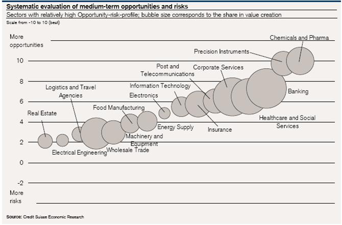
This is an interesting example of a pictogram or scatter chart to represent two variables: 1) level of opportunity/risk (vertical scale) and 2) size of share value (size of bubbles).
But examing this chart, it made me wonder – what does the horizontal scale represent? In other words, on what basis are the bubbles placed left to right? I cannot see any logical basis in the chart for the horizontal location of the bubbles. I think that’s unfortunate as such a chart could use the horizontal scale to reinforce the share value variable or distribute the bubbles on another basis (e.g. sector of interest).
For those interested in graphic presentation of information, some key texts to read are found on the website of Edward Tufte, a leading specialist in this area.
Glenn
