Data visualization for evaluation
July 16, 2013 at 7:02 am Leave a comment
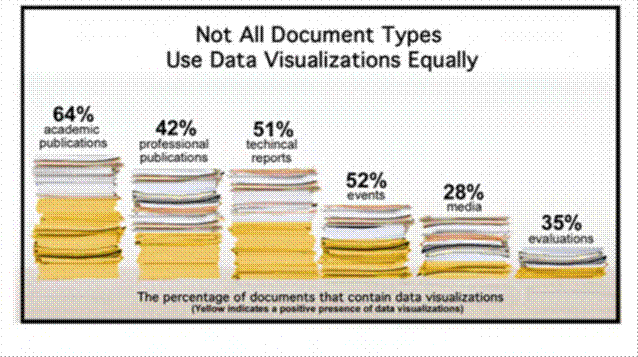
If you are interested in how evaluation results are presented as I am, then you might be interested in this fact sheet (pdf) from IDRC on data visualization for communicating research and evaluation findings. It contains some fascinating information on how data visualization can be used (and misused). As can be seen in the chart below it shows that evaluation reports are on the low end in terms of their usage of data visualization.
Entry filed under: communicating evaluation results, Evaluation reporting, Evaluation use. Tags: evaluation reporting, evaluation use, IDRC.

Trackback this post | Subscribe to the comments via RSS Feed